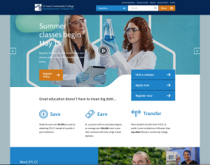
STLCC’s new homepage, which debuted this week, offers an “I want to” button in the header, providing a drop-down list of common starting places for students.
BY: Melissa Wilkinson
Editor-in-Chief
After a several-month delay, STLCC’s new website is finally rolled out. As of Monday, April 30, stlcc.edu is sleek, modern and better than ever, according to Senior Web Designer Ben Shasserre.
“The main thing is that it’s a responsive website,” said Shasserre. “That means it’ll work on multiple devices and it’ll look good. When you go to the current website on your phone, you’ve got to pinch and zoom things to read it. All that will be over with.”
Aside from an injection of modern style, complete with brighter colors and simpler layout, the new website is easier to use and more consistent from page to page. According to Shasserre, the search engine is also more “robust,” refined to be more of a “pathways model”, meaning when students search for a subject, the results will yield all programs related to that subject, whether degree or non-degree.
“The system is better organized as a tool to recruit new students,” said Shasserre.
The new website will also help with recruitment through bringing stlcc.edu into the 21st century, said Kedra Tolson, Executive Director of Marketing and Communications. The clean, up-to-date site will help STLCC compete with other community colleges by providing “something nice to show off to prospective students.”
“I’ve been around for quite a while and the outside critique that we often hear is that it’s hard to navigate and students can’t find what they want,” said Tolson. “As soon as you click on [the new website] you’re seeing the things that students, both current and prospective, are interested in. One: I see people that look like me. Two: If I have no clue what I want to do, I can go into this website and get the guidance to figure it out.”
New features of the website include “Meet STLCC”, a collage of current students and their stories, as well as a new top menu bar with a drop-down list titled “I want to…” that provides options to guide prospective or current students in their journey at STLCC.
“If [students] are not exactly sure where to start it allows them to see: I want a four year degree, I want to train for a new job, I want to finish college from another college. It really gives them a place where they can start,” said Shasserre.
The website reboot was initially supposed to hit the web in October 2017 but was delayed until April due to turnover in the web design department and need for more data and user testing. Stlcc.edu was last updated more than five years ago. Work for the new website began nearly two years ago.
While Shasserre warned that there will be a learning curve as current students and staff begin navigating the new website, some elements are the same, such as portal links at the top. But according to Tolson, some changes are for
the better.
“You could say a lot about the old site, but I don’t think that it reflected how we internally feel about ourselves and the public,” said Tolson. “I’m super excited for the website to launch. I think it’ll be easier for our recruiters. I think this tells our story.”


